

Redesigning the Mobile Food Ordering and Loyalty Experience
I redesigned the PAUL mobile app experience to help users order food more easily, understand their
loyalty progress more clearly, and make better use of their rewards, wallet balance, and membership benefits.
01 — Project Goal
Mobile ordering, loyalty, and wallet experience redesign
PAUL is a restaurant chain mobile application that allows users to order food through delivery, pickup, and catering options. The app also includes a loyalty system where users can earn points based on restaurant visits and order spending.
Although the app offers multiple useful services, the goal of this redesign was to make the experience clearer, faster, and more rewarding. I focused on improving how users understand their loyalty status, track their tier progress, view loyalty benefits, and complete delivery or pickup orders with less friction.
The main goal of this project was to connect ordering, loyalty, wallet rewards, and restaurant visits into one seamless mobile experience.
02 — The Problem
Loyalty value was not visible enough during the journey
In restaurant apps, users usually want to complete simple actions quickly: order food, check rewards, use discounts, find nearby restaurants, or track an order. However, when loyalty points and membership benefits are not clearly presented, users may not fully understand the value they have earned.
In this experience, users could struggle to answer questions such as:
How many points do I currently have?
What is the AED value of my points?
Which membership tier am I in?
What do I need to do to reach the next tier?
What benefits do I currently have?
How can I earn points from an in-store visit?
Which PAUL restaurant is closest to me?
How can I place a delivery or pickup order quickly?
This could make the loyalty system feel less motivating, reduce reward usage, and create unnecessary friction during the ordering journey.

DESIGN QUESTION
03 — Research & Evaluation
What users need across the PAUL ordering experience
The key insights pointed to a need for more visibility, flexibility, and reassurance across the journey. Users should be able to understand their loyalty progress, easily use available benefits, choose the right ordering option, and feel confident after placing an order.
Key Insights
01
Users are more likely to engage with a loyalty system when they can immediately understand their current points, membership tier, and progress toward the next level.

03
PAUL users may want different ordering options depending on their situation. Some users want delivery, some want pickup, and others may need catering or special cakes.

04
04 — Target User
Meet Wade, A frequent PAUL customer

Wade
Frequent PAUL Customer · Dubai
Wade is a hypothetical PAUL customer who regularly orders food through the mobile app and also visits PAUL restaurants in person.
HIS Goals
Track loyalty points and understand membership benefits
Use available discounts and gifts before checkout
Earn points from both app orders and in-store visits
Find nearby PAUL restaurants
Track order status after placing an order
Core Need
“I want to know how many points I have, what rewards I can use, and how close I am to my next membership tier while still being able to order food quickly.”
05 — Experience Strategy


06 — New User Flow
A clearer path from homepage to checkout and rewards
1
Open the app and view loyalty status on the homepage
2
Check tier status, points, and membership progress
3
Choose an ordering option
4
Select Delivery, Pickup, Catering, or Special Cakes
5
Browse products and add items to the cart
6
Review available discounts and gifts
7
Apply wallet benefits or membership offers
8
Complete checkout
9
Track order status from the order detail screen
10
Rate the order after completion and review tier progress
07 — Key Design Solutions
From insight to interface
Click on any iPhone to view it in full-screen mode for a more immersive and cohesive experience.


Solution 01
Tier Progress Visualization
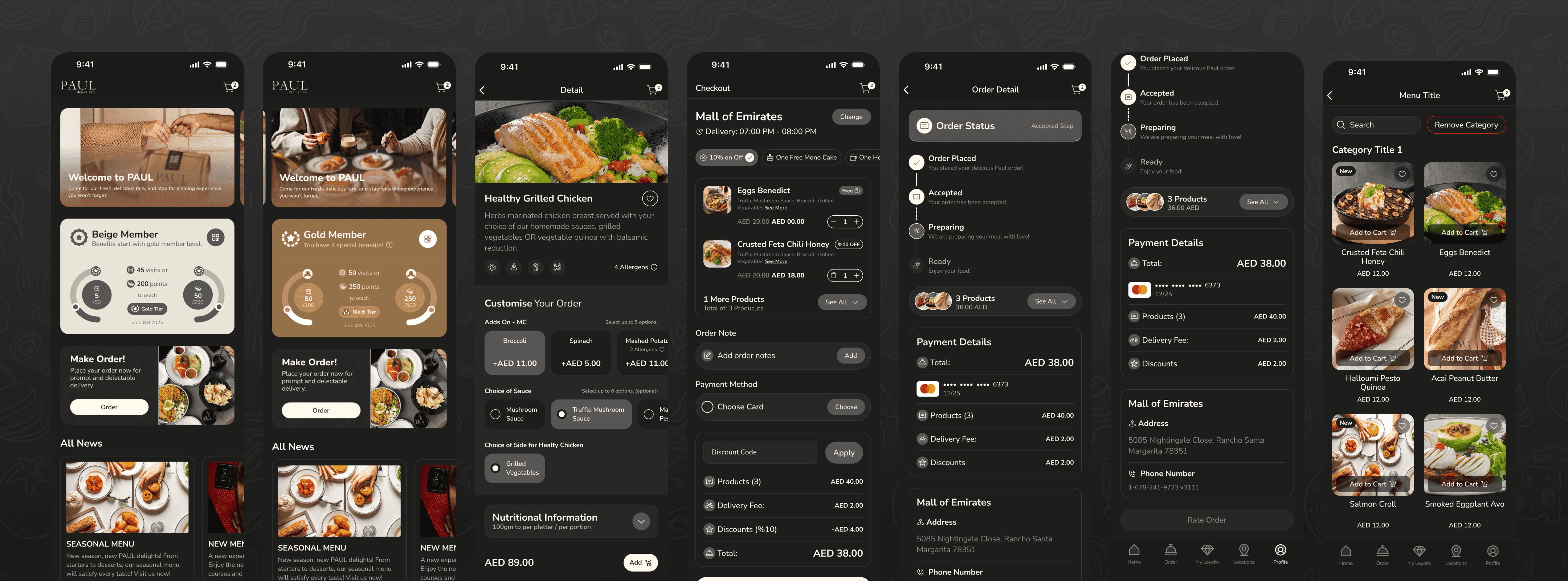
The membership system was redesigned with a clear progress bar that shows the user’s current position between Gold, Platinum, and Black tiers.
This helps users understand:
Their current tier
The next tier
How many points or visits are required
The goal was to make the tier system feel transparent and motivating.
Solution 02
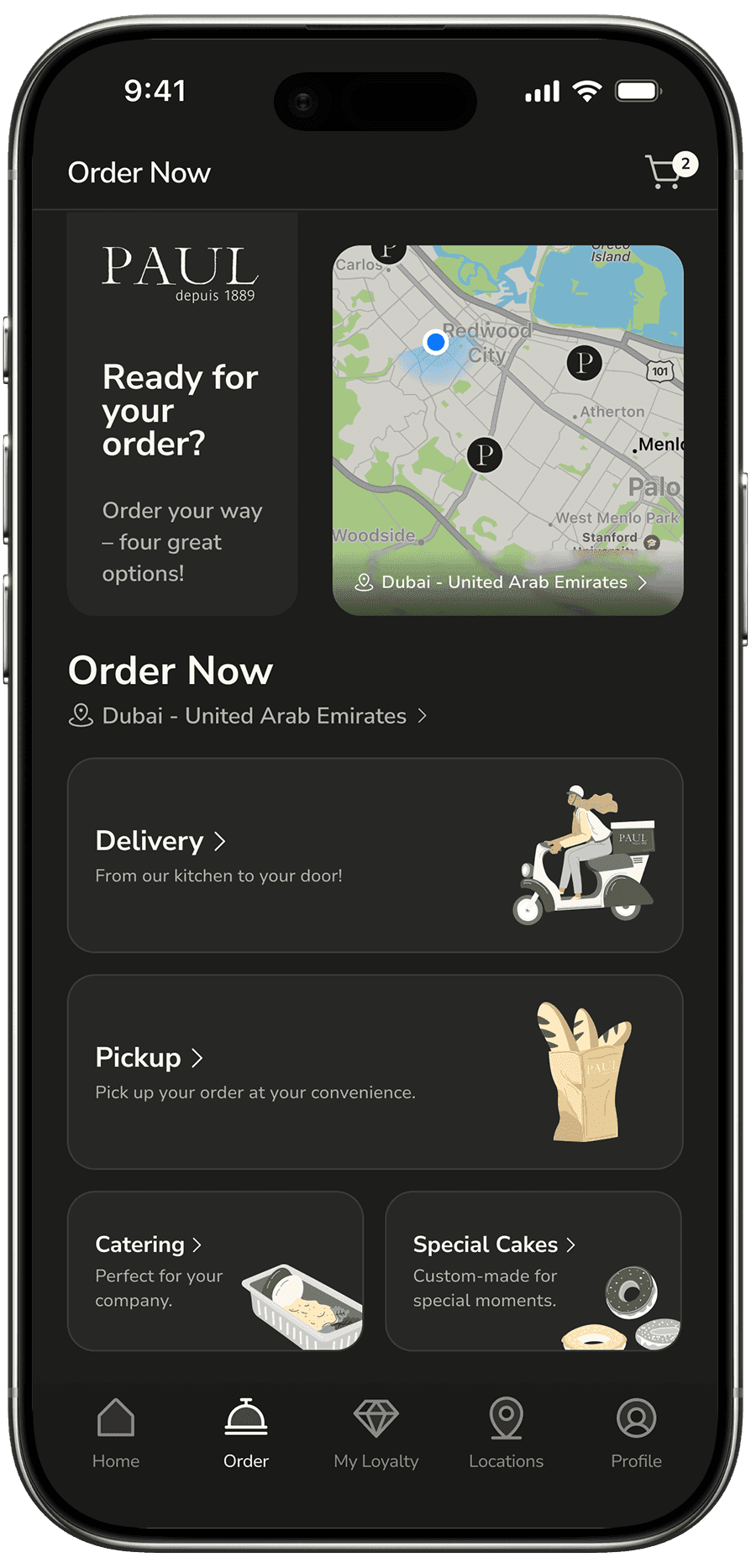
Order Type Selection
The order experience was simplified by presenting four main ordering options:
Delivery
Pickup
Catering
Special Cakes
Each option includes a short description and supportive illustration, helping users choose the right service quickly.
This structure reduces decision-making time and makes the ordering flow feel more guided.

Solution 03
Paul Loyalty Experience
I designed the PAUL Loyalty screen as a central place for rewards and benefits.
the loyalty ıncludes:
Total points
AED equivalent points information
Available gifts
Used gift status
Discounts and member benefits
This makes the user’s rewards easier to understand and encourages them to use benefits before they expire or become forgotten.
Solution 04
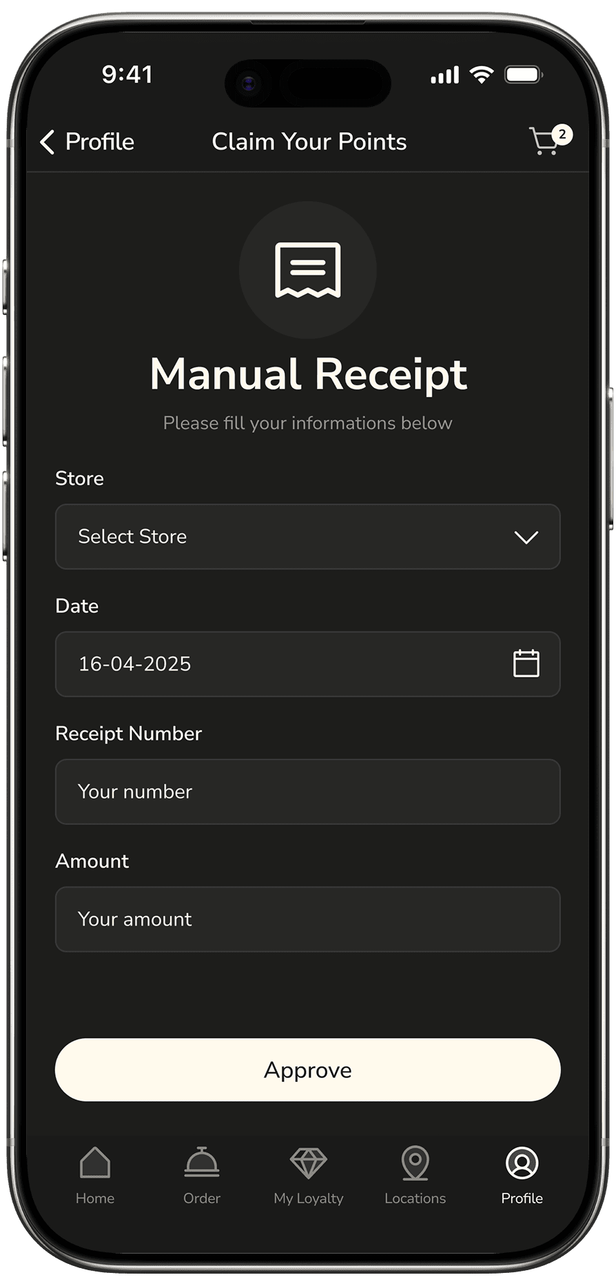
Manual Point Collection
To support users who visit PAUL restaurants in person, I included a “Collect Points” flow where users can manually earn points by entering their receipt information.
This connects offline restaurant visits with the digital loyalty experience.
It also helps users feel that every visit counts, even when they do not order directly through the app.

Solution 05
Order Detail and Tracking
The order detail screen was redesigned to make order status easy to follow after checkout.
The timeline shows stage of the order:
Order Placed
Accepted
Preparing
Ready
The screen also includes checkout information to ensure a smooth and accurate experience.
Solution 06
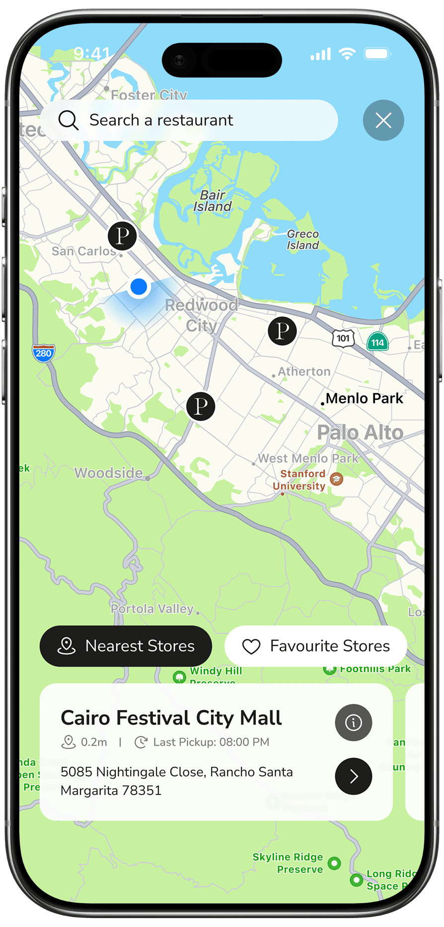
Nearby Restaurants
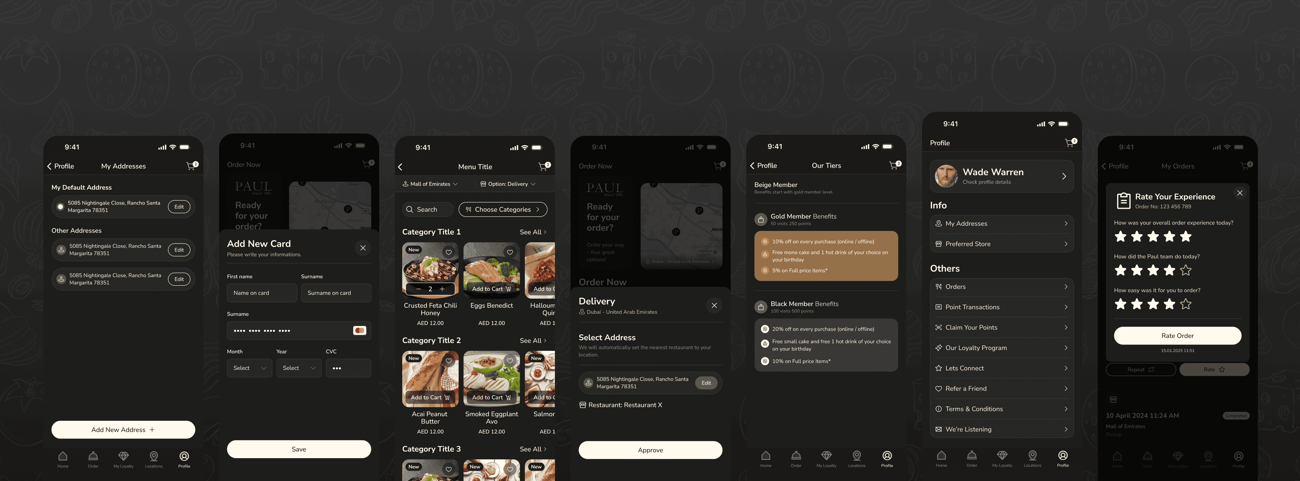
The app allows users to find nearby PAUL restaurants and choose a location for pickup or browsing.
Pick up an order
Visit the nearest PAUL restaurant
Collect points from an in-store visit
Check location availability before ordering
This feature connects the digital experience with the physical restaurant network.
08 — Visual Design
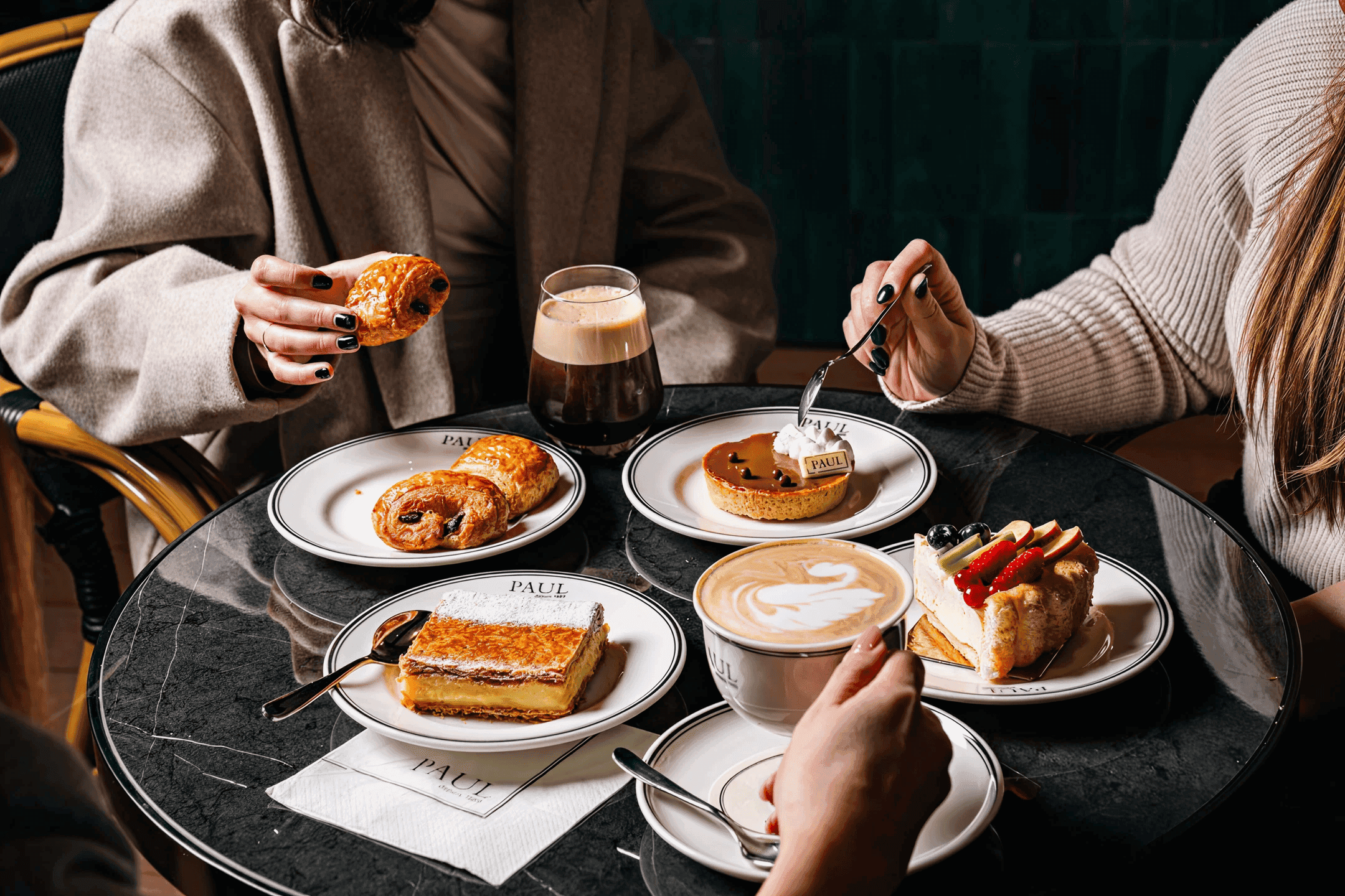
Refined Visual Language
Designed to reflect PAUL’s premium, warm, and timeless brand identity across the digital experience.





09 — Accessibility
Making rewards, ordering, and navigation easier to read and useered throughout the process
Making rewards, ordering, and navigation easier to read and use
Sufficient contrast between text and background
Informational bottom sheets and pop-ups
Touch-friendly buttons and cards
Simple progress indicators for loyalty and order tracking
Icons supported by text labels
Clear price, discount, and total information
Clear active states in the bottom navigation
Consistent placement of primary actions
10— What I Learned
A restaurant app is also a loyalty and relationship platform

This project helped me understand that a restaurant app is not only an ordering tool. It is also a loyalty, rewards, and customer relationship platform.
Users need to complete orders quickly, but they also need to feel that their visits, spending, and engagement are valuable. A strong loyalty experience should make progress visible and rewards easy to use.
I also learned that wallet and membership features become more effective when they are connected directly to the ordering journey. Showing discounts, gifts, points, and tier status at the right moments can increase user motivation and reduce uncertainty.
11 — Expected Impact
Increasing loyalty engagement and reducing ordering friction
Because the project was not tested with real users, there are no measurable outcomes. The design is expected to have a positive impact in several areas.
Better understanding of loyalty benefits
Increased awareness of available gifts and discounts
Higher engagement with the membership system
Improved confidence during order tracking
Faster access to delivery and pickup ordering
Stronger connection between in-store visits and app loyalty
More repeat orders through visible rewards
Easier use of wallet rewards and gifts
12 — Next Steps
Where I would take this next
13 — Conclusion
Bringing rewards closer to the ordering experience
In the PAUL mobile app redesign project, I focused on improving the relationship between ordering, loyalty, wallet rewards, and restaurant visits.
The redesigned experience makes loyalty progress more visible, helps users understand their benefits, and supports faster delivery, pickup, catering, and special cake ordering.
By placing points, wallet balance, tier progress, available rewards, and order actions at the center of the mobile journey, the app helps users order with less friction and engage more confidently with the PAUL loyalty system.


