

Redesigning the Starbucks Türkiye Web Experience
I renewed the Starbucks Türkiye website experience to create a more modern, spacious, and engaging digital platform that better reflects the Starbucks brand across homepage content, account areas, campaign sections, special brand pages, and the e-gift card purchase flow.
01 — Project Goal
Creating a Modern and Brand Consistent Digital Experience
Starbucks Türkiye’s website is a key digital touchpoint where users can explore campaigns, browse products, learn about Starbucks Rewards, discover Starbucks Reserve, access e-gift card options, find stores, and manage their account experience.
The main goal of this project was to renew the website by creating a more balanced, modern, and brand-consistent experience. The previous structure relied heavily on a large banner area on one side of the page, which made the layout feel visually divided and limited the way content could be presented.
I redesigned the experience to make the website feel more spacious, interactive, and aligned with Starbucks’ digital brand language. Another important goal was to improve consistency between the web experience and the Starbucks mobile app, especially for signed-in users within the account area.
02 — The Problem
A banner-heavy structure that limited flexibility, clarity, and brand expression
The existing experience created several design and usability challenges:
The page layout felt visually divided because of the large banner area on the left side.
Campaigns and content areas did not have enough flexibility to be presented in different formats.
The overall visual structure felt less spacious and less modern than the desired Starbucks brand experience.
Interactive brand storytelling opportunities were limited.
The signed-in account experience on the website did not fully match the visual language of the mobile app.
The e-gift card purchase flow was presented as one long step, which made the process feel heavy and difficult to scan.
Important sections such as Starbucks Rewards, Starbucks Reserve, and Starbucks Truck needed a stronger visual and experiential identity.
This structure made the website feel less dynamic and less connected to the premium, warm, and modern Starbucks experience users expect.

DESIGN QUESTION
How might we renew the Starbucks Türkiye web experience so that users can explore content more comfortably, interact with the brand more meaningfully, complete e-gift card purchases more easily, and experience a consistent visual language across web and mobile?
03 — Research & Evaluation
Key areas for creating a more connected account experience
The review showed that the Starbucks web experience needed stronger alignment across content structure, e-gift card purchasing, top-up settings, and account features. Improving these areas would make the journey feel clearer, more transparent, and more consistent with the mobile app experience.
Key Insights
01
The website needed a more flexible content structure
The previous layout depended too heavily on a large banner area, which made the page feel visually split and limited how different content types could be shown.


02
The e-gift card flow needed to be divided into clearer steps
The previous e-gift card purchase process was presented as one long flow, which made the experience feel overwhelming.
03
Top-up settings needed to be more transparent
Previously, users couldn’t clearly see the balance threshold and auto top-up amount together, making it harder to understand when and how much would be added.

04

04 — Target User
Meet Kübra, a freelance Graphic Designer
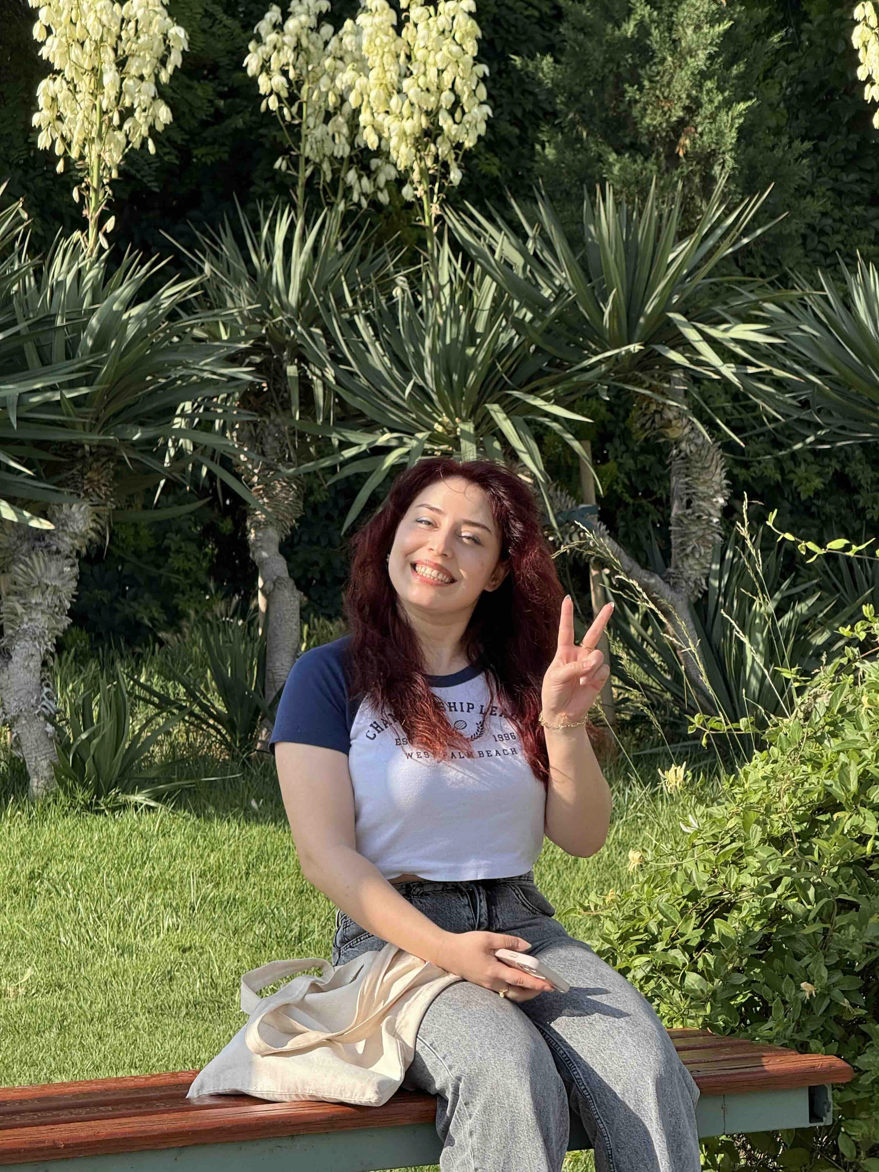
Kübra
Starbucks Customer and Rewards Member
Kübra is a Starbucks customer who regularly visits Starbucks stores, uses digital services, follows campaigns, and occasionally purchases e-gift cards for friends or colleagues.
Her Goals
Discover campaigns and new Starbucks content easily
Access her account information quickly after signing in
Experience a consistent design between the mobile app and the website
Purchase an e-gift card without feeling overwhelmed
Navigate the website comfortably on both desktop and mobile
Core Need
“I want the Starbucks website to feel as modern and familiar as the mobile app, and I want to complete tasks like checking my account or buying an
e-gift card without getting lost.”
05 — Experience Strategy
Four principles behind the design
01
1
Create a flexible content system
Instead of relying on one dominant banner area, the website should support multiple content formats, campaign and storytelling blocks.
02
2
Strengthen brand expression
The digital experience should reflect Starbucks’ warm, premium, modern, and recognizable brand identity.
03
3
Make complex flows feel lighter
Long processes such as e-gift card purchasing should be divided into clear, manageable steps.
04
4
Keep web and mobile consistent
Signed-in users should experience a familiar product language across the Starbucks mobile app and the website.
06 — New E-GIFT Flow
I reorganized the main e-gift card purchase flow as follows:
1
Choose an e-gift card design
2
Select the gift card amount
3
Choose the payment option
4
Enter recipient information
5
Enter sender information
6
Review the order details
7
Continue to payment
8
Complete the purchase
9
View the confirmation state

07 — Key Design Solutions
From insight to interface
Click on any image to view it in full-screen mode for a more immersive and cohesive experience.
SOLUTION 01
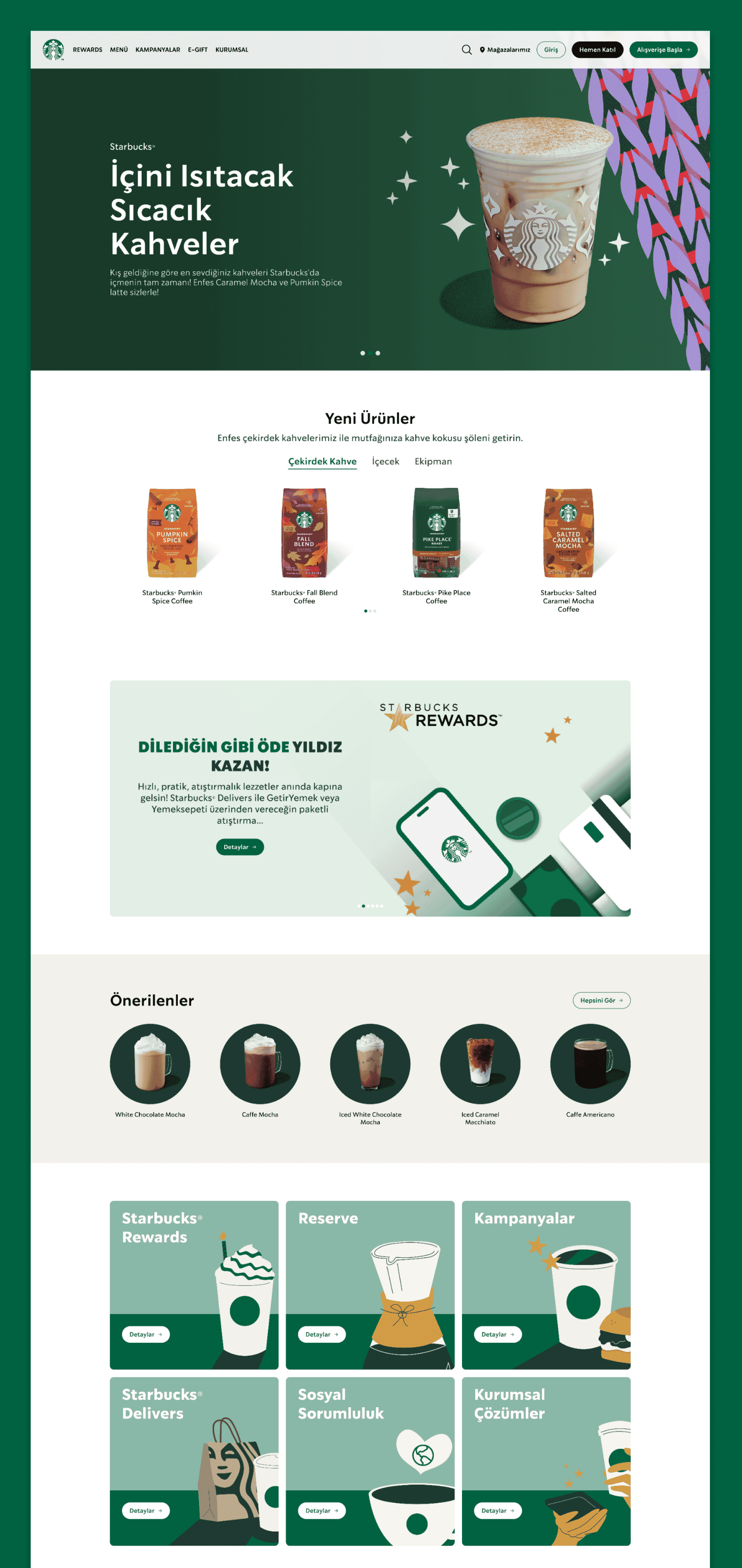
Flexible Homepage Layout
I redesigned the homepage structure to move away from the previous two-part layout dominated by a large banner area.
Instead of relying on a single oversized visual section, I created a more flexible structure with multiple banner areas and content sections.
This allowed the website to present campaigns, products, seasonal messages, and brand content in a more balanced and modern way.

SOLUTION 02
Modern and Spacious Page Design
The new website design uses larger content areas, clearer spacing, and a stronger visual hierarchy.
The goal was to make the pages feel more spacious, easier to scan, and more aligned with a contemporary Starbucks digital experience.
This approach helped reduce visual heaviness and gave each content block more room to communicate its purpose.

SOLUTION 03
Interactive Motion Elements
I added interactive and animated elements to make the experience feel more dynamic and memorable.
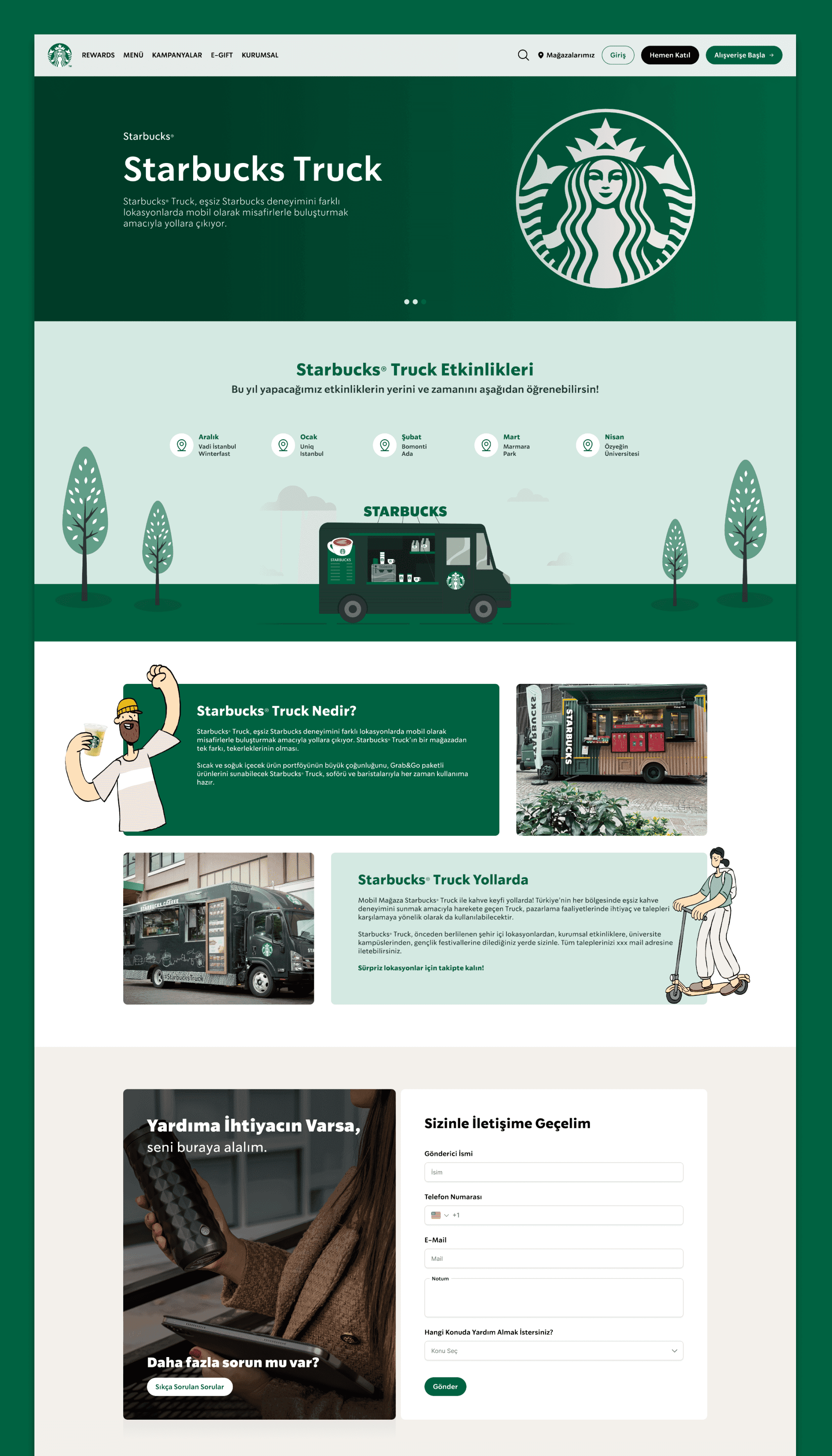
One of the most important examples was the Starbucks Truck page. I designed a moving truck interaction to support the page concept and create a more playful brand experience.
This motion detail helped transform the page from a static information screen into a more engaging and distinctive digital moment.

SOLUTION 04
Web and Mobile Account Consistency
The signed-in account area was redesigned to match the visual language of the Starbucks mobile app.
By aligning the web account experience with the mobile app, the product feels more connected and familiar for users who interact with Starbucks across multiple platforms.

SOLUTION 05
Improved E-Gift Card Screen Structure
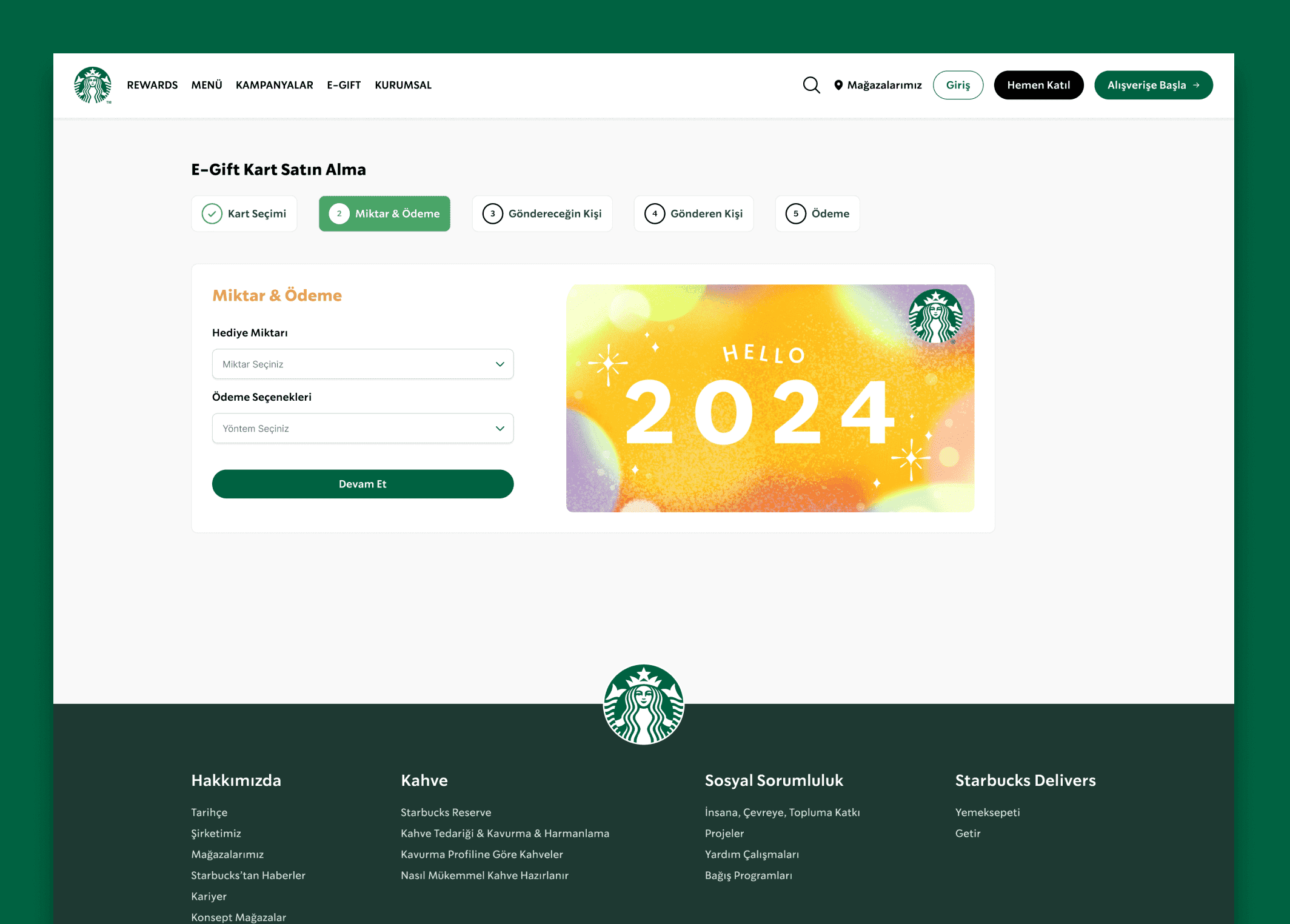
The e-gift card screens were designed with a clear split between form inputs and card preview.
On the Amount & Payment step, users can select the gift amount and payment option while seeing a large visual preview of the selected card.
This layout helps users understand both the functional and emotional sides of the gift card experience.
SOLUTION 06
Five-Step E-Gift Card Flow
The e-gift card purchase journey was redesigned from one long process into a clearer five-step flow.
The new flow includes:
Card Selection
Amount & Payment
Recipient
Sender
Payment
This structure helps users understand where they are in the process and what information is required at each step.

SOLUTION 07
Starbucks Rewards Page
The Starbucks Rewards page was redesigned to feel modern, clear, and visually strong.
The page focuses on communicating the value of the rewards experience while preserving the familiar Starbucks brand atmosphere.
The goal was to make the page more appealing for users who want to understand membership benefits and engage with the Starbucks ecosystem.

SOLUTION 08
Starbucks Reserve Page
The Starbucks Reserve page was designed with a more premium and refined visual direction.
The page needed to reflect the special character of the Reserve experience, so the design language focused on elegance, storytelling, and a more elevated brand feeling.
This helped distinguish Starbucks Reserve from standard content pages while still keeping it connected to the overall Starbucks identity.
SOLUTION 09
Starbucks Truck Page
The Starbucks Rewards page was redesigned to feel modern, clear, and visually strong.
The page focuses on communicating the value of the rewards experience while preserving the familiar Starbucks brand atmosphere.
The goal was to make the page more appealing for users who want to understand membership benefits and engage with the Starbucks ecosystem.

SOLUTION 10
Clear Auto Top-Up Amounts
I redesigned the Starbucks Card top-up screen to make the automatic top-up logic clearer.
Previously, users could not easily understand when money would be added or how much would be loaded. To solve this, I made both the balance threshold and top-up amount visible, so users can clearly see the trigger condition and amount before saving.
This makes the process more transparent and gives users a stronger sense of control over their Starbucks Card balance.
08 — Visual Design
Preserving the Starbucks identity while creating a cleaner digital interface
In the visual design, I aimed to preserve Starbucks’ recognizable brand identity while creating a cleaner, more modern, and more premium web experience.





09 — Responsive Design
Adapted for desktop, and mobile
The experience was adapted across screen sizes, reshaping layout and navigation to fit each context.
Desktop
Consistent account design with the Starbucks app
Wider and more spacious page layouts
Flexible banner and campaign sections
Richer brand storytelling areas
Step by step e-gift card purchase flow
Mobile
Simplified page structures
Stacked content sections
Touch friendly actions
Strong visual hierarchy
Mobile friendly form fields


10 — Accessibility
Making the renewed interface easier to scan, understand, and interact with
The following considerations were included in the design process:
Visual feedback for selected steps and actions
Consistent navigation and page structure across devices
Visible focus states
Sufficient spacing between interactive elements
Clear error messages
Touch-friendly button and input sizes
Clear step indicators in the e-gift card flow
Keyboard-accessible navigation
11 — What I Learned
Understanding how structure, motion, and consistency shape brand perception

This project helped me understand how important visual structure is for a large consumer brand website.
A website like Starbucks Türkiye is not only a place for information; it is also a brand experience. For that reason, layout, spacing, motion, campaign visibility, and cross-platform consistency all play an important role in how users perceive the brand.
I also learned that long flows, such as e-gift card purchasing, can feel much easier when they are divided into clear steps. Even without changing the core task, restructuring the journey can reduce cognitive load and make the experience feel more controlled.
Another important learning was the value of consistency between web and mobile. When users are familiar with the mobile app, the web account experience should feel connected to that same product ecosystem.
12 — Expected Impact
Defining expected outcomes despite the absence of user testing metrics
Because the project was not tested with users and no quantitative metrics were available, there are no measurable outcomes.
A more modern and premium website perception
Stronger design consistency between the web and the mobile app
Better content visibility across the homepage and campaign areas
More engaging Starbucks Rewards, Reserve, and Truck pages
A more flexible structure for future campaigns and brand content
A more memorable brand experience through interactive motion details
A more memorable brand experience through interactive motion details
Lower cognitive load in long form-based flows
13 — Next Steps
Where I would take this next
14 — Conclusion
A renewed Starbucks web experience built around clarity, flexibility, and brand consistency
In the Starbucks Türkiye website renewal project, I focused on transforming the website into a more modern, flexible, and brand-consistent digital experience.
The renewed design replaces the previous banner-heavy structure with a more spacious content system, introduces interactive brand moments, aligns the signed-in web account experience with the mobile app, and simplifies the e-gift card purchase journey through a five-step flow.
The result is a cleaner, more engaging, and more scalable web experience that better reflects the Starbucks brand across key user journeys and special brand pages.


